RADHawk
UI/UX
A radiology educational tool that brings clarity and control to your daily workflow, no matter your role
Team members:
Yu-Hsin Lin, Keyu Zhu, Junbin Yin, Jyotiraditya Ingawale
2025.03 - 2025. 05
….overview
RADHawk is an AI-powered radiology learning platform developed by Dr. Janet Reid for radiologists at the Children’s Hospital of Philadelphia. It intelligently curates reference materials and lecture content to support learners at different levels. Our team worked closely with RADHawk to optimize the platform’s usability, design, and overall learning experience in preparation for broader market expansion.

… problems identification
Users struggle to navigate RADHawk due to poor content organization and lack of onboarding guidance. The platform doesn’t fully align with their clinical workflow, as they need faster access to visual references. Additionally, accessing materials remotely can be cumbersome, often requiring unnecessary login steps
method 1: Focus Group
Session Structure
3 Sessions, 20 minutes each
18 radiologists (residents, fellows, attendings)
Mixed experience levels in each group
Small-group format for open discussion
Discussion Focus
Usage patterns & confusion points
System feedback & error handling
Navigation & labeling clarity
Visual readability in clinical settings
Learning needs & feature usefulness
method 2: Heuristic Evaluation
Evaluation Process
Independently completed in 15–20 minutes
Participants received a short orientation with examples to ensure clarity on each heuristic.
Scored each issue from 0 (no problem) to 4 (critical issue)
Wrote down personal observations and recommendations
method 3: Interview
Interview Structure
Background & Role Context
Usage Patterns & Challenges
Feature-Specific Questions (e.g., minimize )
Role-Specific Follow-Ups for attendings, fellows, and residents
method 4: Survey
Participant Background
Attending Radiologists: 12 (70.6%)
Fellow Radiologists: 3 (17.6%)
Residency Radiologists: 2 (11.8%)
RADHawk Usage Frequency
Daily: 8 (47.1%)
3–4 times/week: 4 (23.5%)
1–2 times/week: 3 (17.6%)
Rarely: 2 (11.8%)
Key Insights:
Users want to pin or prioritize frequently used resources for faster access.
RADHawk sometimes shows outdated or mismatched resources across studies or users
Users want to minimize or reposition RADHawk to avoid blocking their workspace.
Users find icons hard to recognize and prefer clearer visuals or text labels.
Concern:
Top 1: Visibility of System Status (Score 2.2)
75 % of users complain they can't minimize or reposition the interface, and closing it makes it hard to reopen
Top 2:Flexibility and Efficiency of Use (Score 2.7)
50% of users cannot quickly access frequently used or personalized functions
Top 3: Aesthetic and Minimalist Design (Score 2.2)
40% of users think the Interface feels cluttered or overloaded
Suggestions:
Add a minimize function and allow users to pin or prioritize frequently used resources for quicker access and less screen interference
Enable users to reorder content by popularity, create a “frequently used” section, and optionally support keyboard shortcuts for efficiency
Group related content by modality, function, or use case to reduce visual clutter and improve navigation clarity.
Key Insights:
Users want easier ways to save and revisit frequently used resources across devices.
Users want a clearer structure and guidance tailored to different experience levels.
Users prefer quick, visual references—like tables and diagrams—over long articles or lectures.
Users want instant access to relevant resources during study review, without losing context.
Users want control over RADHawk’s screen behavior to avoid clutter and distraction.
Result:
64% Customer Satisfaction (CSAT)
Indicates moderate satisfaction, with room for improvement in usability and clarity.
+11.8 Net Promoter Score (NPS)
Suggests users see potential in the product, but aren’t fully convinced to recommend it yet.
Insights:
42% are not satisfied with navigation
Different experts have different customized demands
“ How might we make RADHawk easier to access, navigate, and use in clinical workflows, so that users of all experience levels can efficiently find and act on the information they need?”
… user workflow & ideations

… user flow
Grounded in early research insights, we restructured RADHawk’s user flow and explored several design directions, working closely with the engineering team to assess technical feasibility
… impact & effort matrix

We shared our ideas with the technical team and invited them to collaboratively assess each concept based on its impact and required effort. Together, we created a visual prioritization matrix to help determine which ideas to move forward with first
… wireframe
Based on the user flow and results from the matrix, we created an initial wireframe

PROTOTYPE
PROTOTYPE

01/ Comfortable in the Dark
Radiologists spend long hours in dim reading rooms.
We designed a dark mode to reduce eye strain, maintain visual clarity, and support focused diagnostic work.

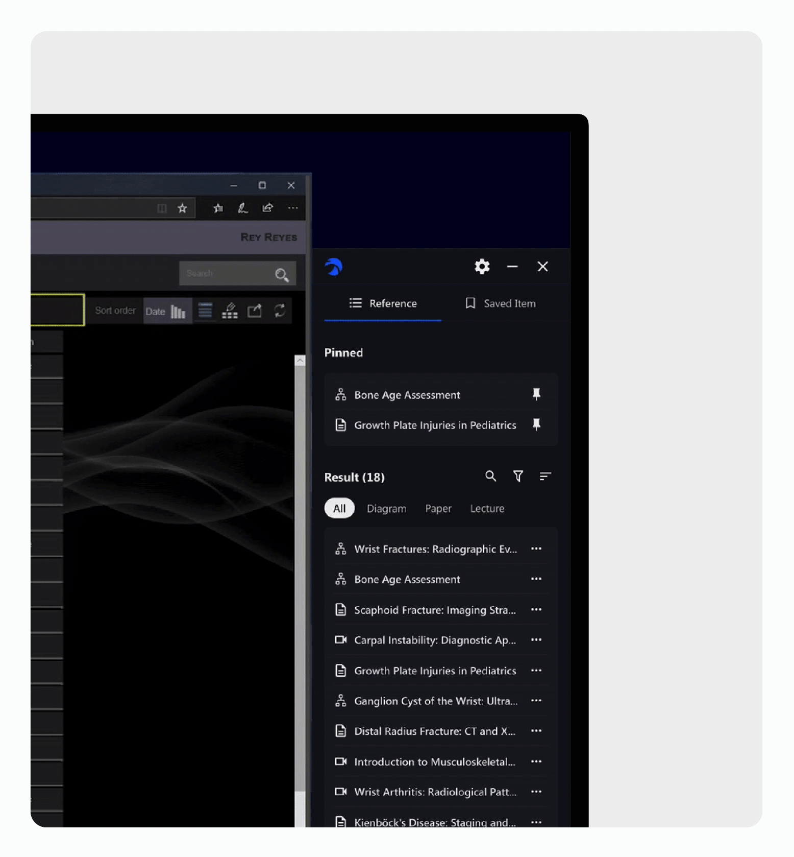
02/ Go-To References, Always Ready
With RADHawk’s pinning feature, you can pin your most-used references in one place. No more re-searching, just quick access when you need it most.

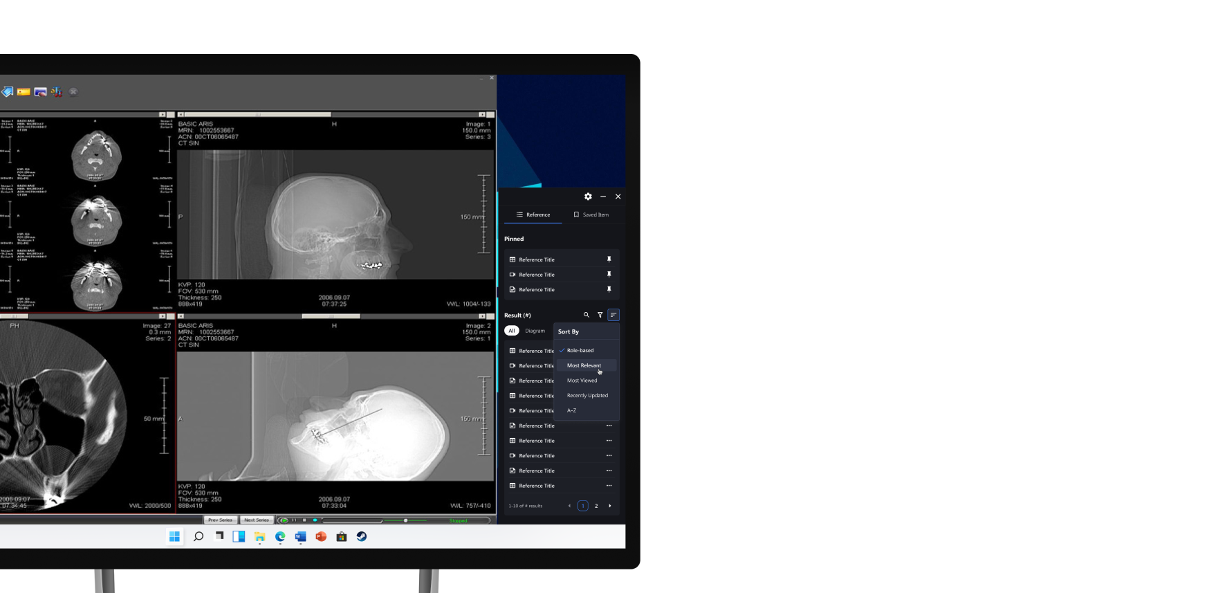
03/ Smarter Ways to Access Information
Filter and search to find the right information. Whether you're reviewing cases or prepping to teach, RADHawk helps you surface what matters in seconds.
04/ Content
That Fits Your Role
Different users need different content. RADHawk adapts to your role by surfacing the most relevant material first. With tabs and sorting, you can quickly jump to the type of reference that fits your workflow